Supercharge building Webflow apps
Ship faster with Webflow's design system, Svelte components and user-friendly CLI that streamline your workflow.

What's included?
Complete app-building toolkit
Accelerate your workflow with pre-built components, design systems, and intuitive CLI tools.
Figma UI Kit
Leverage Webflow's design system to skip the basics and dive straight into crafting your app's features.
Svelte components
Streamline your Webflow projects with powerful, plug-and-play building blocks.
CLI for faster workflow
Webflow Svelte CLI is a tool designed to simplify the process of adding components in a project.
Components
Build Webflow apps faster with Svelte components
A comprehensive collection of accessible components that match Webflow's design system.

Accordion
4 components

Aspect ratio
1 component
Avatar
2 components

Button
2 components

Checkbox
3 components

Combobox
7 components

Divider
1 component

Dropdown menu
15 components

Empty state
5 components

Fieldset
7 components

Link
1 component

Note
5 components

Number input
1 component

Progress
1 component

Radio group
3 components

Scroll area
1 component

Select
9 components

Slider
1 component

Spinner
1 component

Switch
2 components

Tabs
4 components

Text input
1 component

Textarea
1 component

Tooltip
3 components
Features
Everything you need to build Webflow apps
Simplify design and development cycles with our optimized, time-saving assets and components.
Source code
Get access to all of the source code from our versatile Webflow app components.
<script lang="ts">
 import { Avatar } from 'bits-ui';
 import { Account } from '$lib/components/icons';

 type $$Props = Avatar.Props & {
   image?: string | null;
   fallback?: string | null;
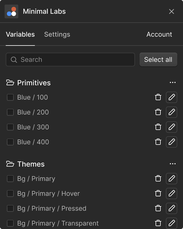
Variables & Styles
Maintain consistent design with variables and styles for colors, typography, and spacing.
Themes
Automatically detects and syncs with Webflow's interface appearance settings.


Accessible components
Production-ready components to help you build interfaces faster and with confidence.
200+ Icons
Fully compatible with the Figma file. Optimized and ready for immediate use.
State Communication
WCAG 2.1 Compliance
Keyboard Navigation
WAI-ARIA Compliance
State Communication
WCAG 2.1 Compliance
Keyboard Navigation
WAI-ARIA Compliance
Accessible components
All components ensure accessibility standards, leveraging Bits UI headless component library.
Benefits
Bridge design and development
Seamlessly transition from Figma designs to functional UI with our integrated kit and Svelte component library.
Kickstart your app
Streamline your workflow and focus on what truly matters. 200+ hours saved means more time for innovation and growth.
Build logic, not components
Focus on creating business logic rather than endlessly crafting individual components.
Develop app in no time
Pre-made components allow fast app building and shipping in record time.


Keep consistency with ease
From concept to flawless execution, ensure every detail aligns perfectly with your vision and brand standards.
Improved accuracy
Effectively minimizes discrepancies between design and final product.
Scalability
Easily extend the system as new design patterns and components are needed.
Pricing
Choose the perfect plan for your needs
Pay once for a powerful set of tools to boost your workflow. No subscriptions or hidden fees.
$119
A single license for solo designers, developers, and freelancers.
One-time payment - Plus local taxes
$249
Up to 5 users. Perfect for design teams, agencies, and startups.
One-time payment - Plus local taxes
Secure 256-bit SSL Encrypted payments by Lemon Squeezy. The standard local tax rate may be charged, following the law of your country.
FAQs
Everything you need to know
Find answers to common questions about Figma UI Kit and Svelte component library.
General
Licensing
Payments & Billing
Support
Build your app today
Improve the design and development process with the Figma UI Kit and Svelte component library for Webflow apps.

